Managers of a Space can create a theme for their Space. Users who have that Space as their Home (or a sub-Space below it) will see that theme when they use Chorus.
Users only ever see one theme in Chorus - either the site theme, or the theme that their Home Space uses. They will not see different themes when they move between Spaces. Users who do not have a Home Space will see the site theme.
Consider: Before creating themes in Spaces, if your objective is to rebrand the entire site, and you are a Site Administrator, then you can instead use a Site theme.
Step-by-step:
1. Select the space you want to theme.
2. Click Manage → This Space in the right-hand sidebar. The Manage Space modal will open.
3. Choose Space Theme.
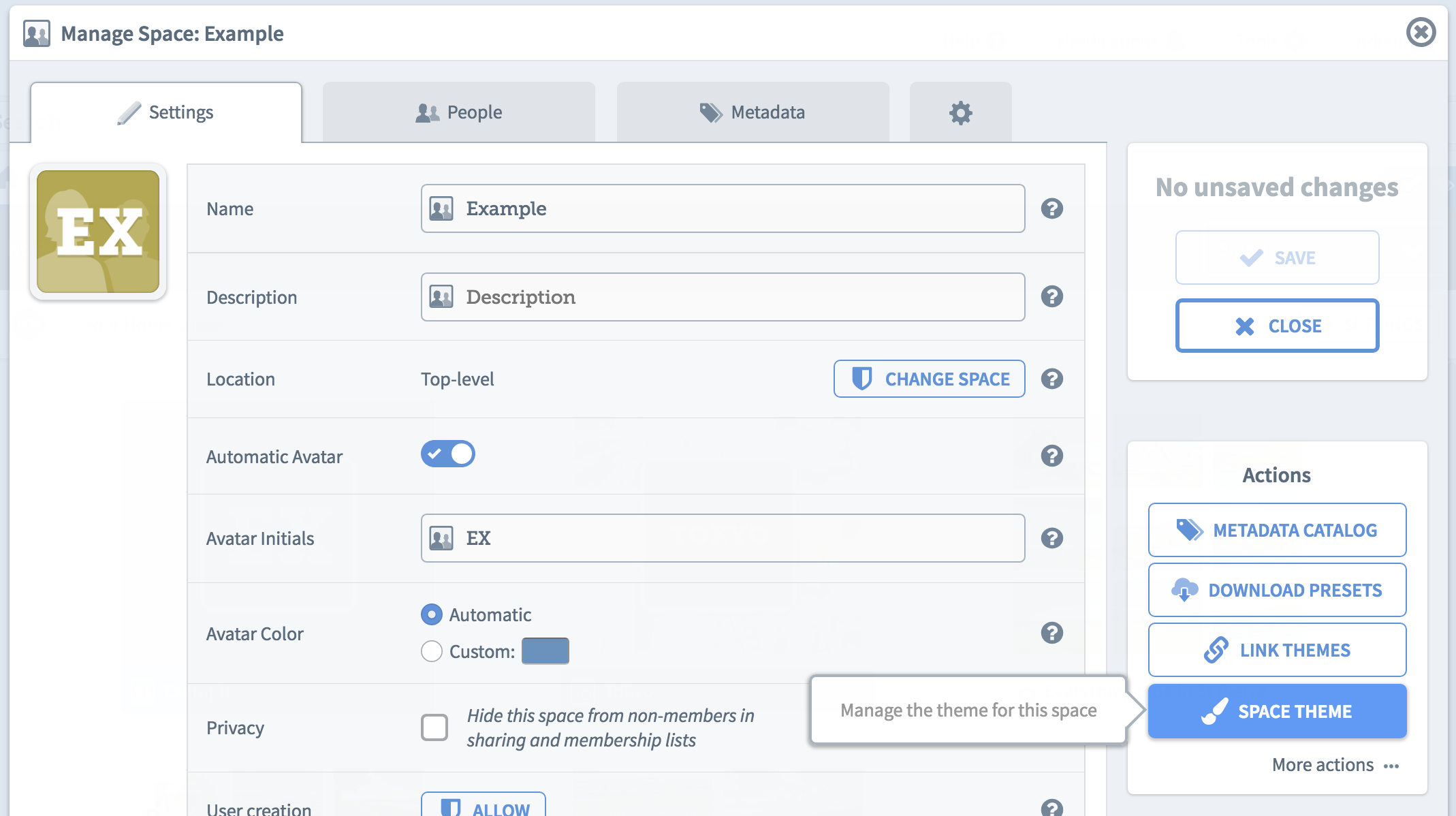
A new window will open to allow you to edit the settings of the theme.
This page provides a preview of what the theme will look like, before it is applied. You can change settings such as the logo (including its size and location), the foreground and background colors of the search bar and banner, email colors and the login box banner. Each customisable element has an accompanying box with the context of what is being edited.
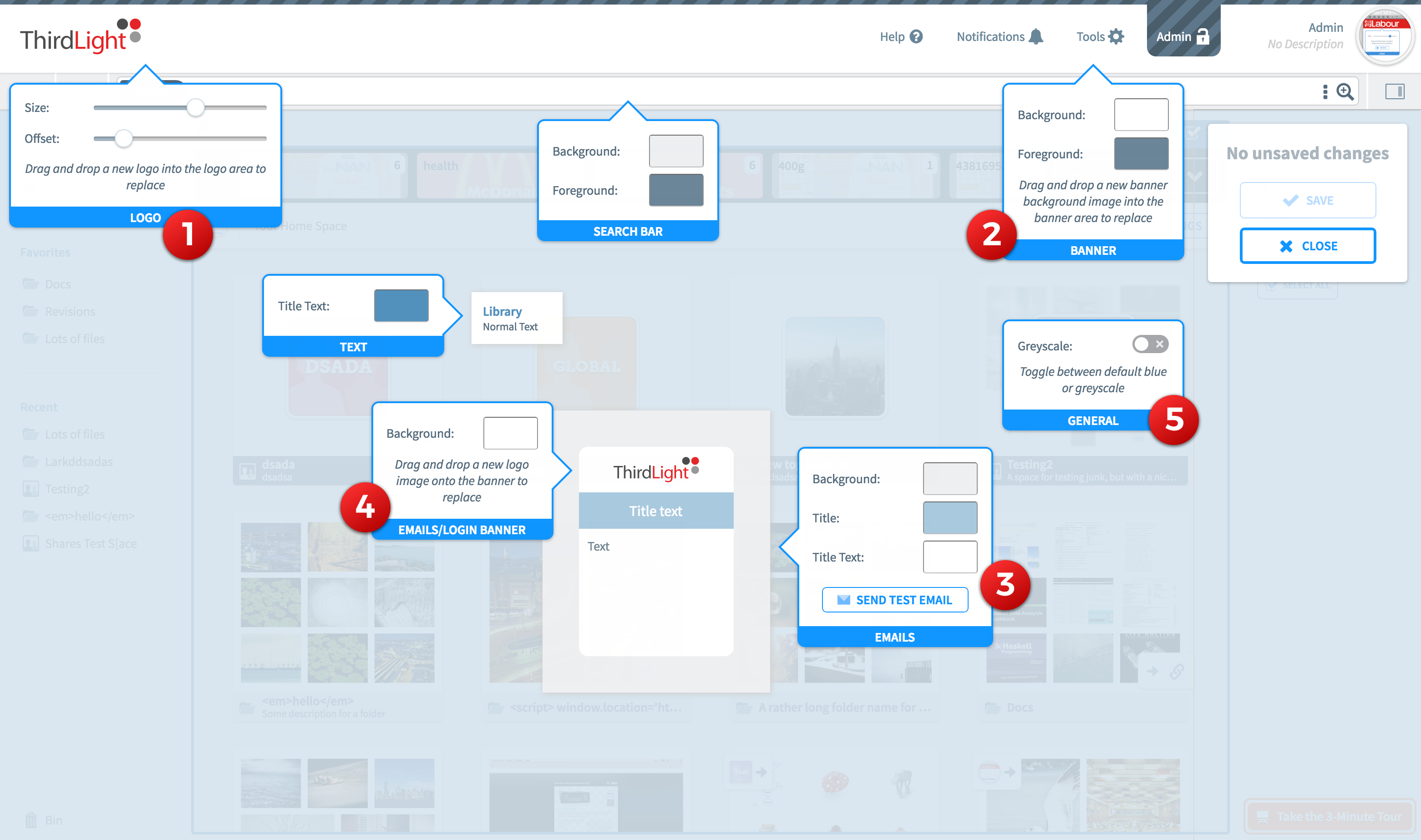
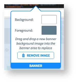
A foreground color can be set for the banner to change the text and icon colours, the banner background color will set a solid colour across the entire banner. The banner background can also be set as an image instead of just a solid background color, this is set to cover the banner background and unlike the logo cannot have its size and positioning set. If a background image is set, you can remove it by clicking the “Remove Image” button.
The majority of colors in Chorus emails can be customised to match the theme, including the background color, banner background color, title background color and title text color. The email box also offers the facility to send a test email.

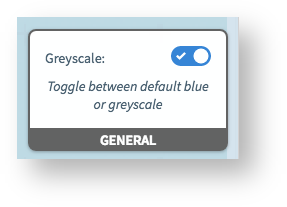
A toggle for “greyscale mode” is presented under the General context, this will toggle all the elements that use the default Chorus light blue (usually on interactive elements) to a grey. Toggling this toggle on and off in the UI will show a preview of this.
5. When you have finished editing the theme, click Save.
The space will now use the new theme.
More on deleting items from Chorus:
You are here:
